Remi Van Oers Time 2.1
Minimalism does not only refer to lifestyles or art, it also extends to endorsing products that present an austere, unfussy appearance. Take the Remi Van Oers Time 2.1 desk clock as an example. This is a simple but eye-catching, functional and unique wall clock that will surely be at home in uncluttered spaces.
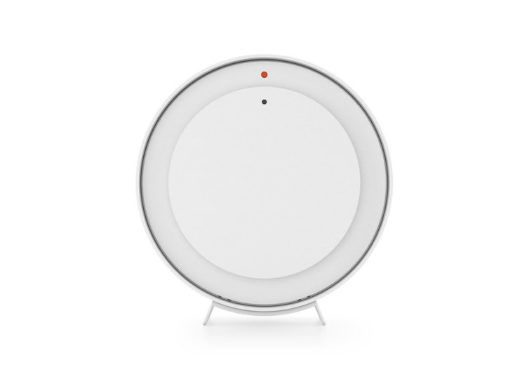
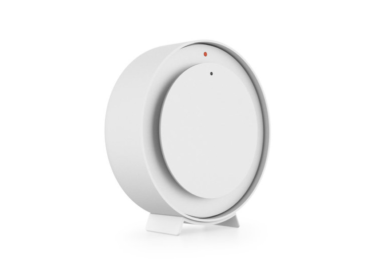
The interesting appearance of the clock is its highest point. The design is clean and understated compared to traditional clocks. It does not come with the usual numeric or digital symbols that represent the time. It features two dots—a bigger orange dot on the outside, which represents the hours and a black dot inside, which indicates the minutes.
We are used to watching the time on our watches and old-timey clocks so you won’t have any problems deciphering the time according to the positioning of the dots. The two circles spin in a manner in which it shows the positioning of the black and orange dots.
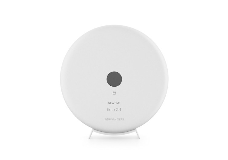
The back of the clock features a smaller type bearing its designer and product name. There is an icon beneath the black center and this serves as some sort of release for the mechanism of the clock. This is for battery changes or adjusting the time. Operations are pretty simple as well; the clock utilizes one AA battery.
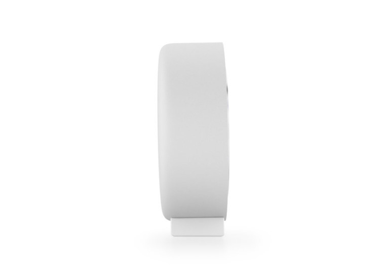
The design of the clock is feasible, too. It features a weighted bottom and its form will not allow it to trundle on flat surfaces. The clock is made by a design studio located in the Netherlands. The studio has been known for creating state-of-the-art designs since 2010.
If you cater to the whole minimalist lifestyle, this is something you might be very interested in. It’s for adventurous folks who want something attention-grabbing for the home as well. The clock not only makes for a beautiful piece, but as a conversation starter, too.


